News
Color Psychology in Perfume Packaging Design: How to Choose the Right Hue to Attract Target Consumers
When it comes to perfume packaging design for brands, one of the most influential yet often overlooked factors is color. The colors you choose for your perfume packaging can deeply affect consumer perception, emotional response, and ultimately, their purchasing decision. By understanding color psychology in perfume packaging design, brands can create an emotional connection with consumers and stand out in a crowded marketplace.
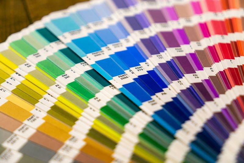
1. How Color Affects Consumer Perception and Purchasing Decisions
Consumers’ psychological reactions to color play a critical role in shaping their perceptions of a perfume brand. Colors evoke emotions and influence the way we feel about a product before we even experience it. For instance, bright colors might give off a playful, youthful vibe, while darker hues might signal sophistication and elegance. The right color can capture attention, enhance a brand’s image, and even encourage consumers to make a purchase.
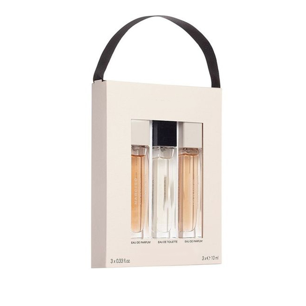
When designing perfume packaging, it's essential to consider the target audience and how certain colors will influence their purchasing behavior. For example, a luxury perfume brand might use rich, deep colors, while a fresh, youthful brand could opt for light, pastel shades.
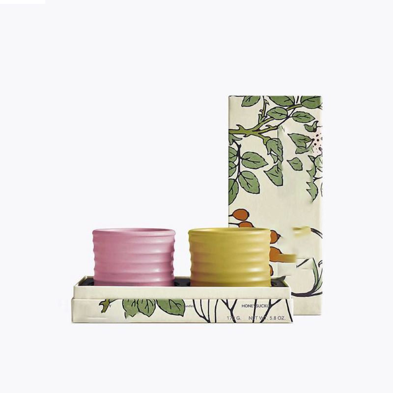 2. The Psychological Effects of Various Colors in Perfume Packaging Design
Colors are not just visually appealing; they carry deep psychological meanings. Here are a few examples of how different colors can shape a consumer’s perception of a perfume:
· Gold: Gold is associated with luxury, wealth, and sophistication. Perfume packaging with gold accents often conveys opulence and exclusivity. Brands targeting high-end markets may choose gold to emphasize quality and status.
· Blue: Blue symbolizes freshness, tranquility, and calmness. It’s a popular choice for fragrances that convey a sense of relaxation or rejuvenation. Light blues can evoke a sense of purity, while deeper blues often communicate reliability and trustworthiness.
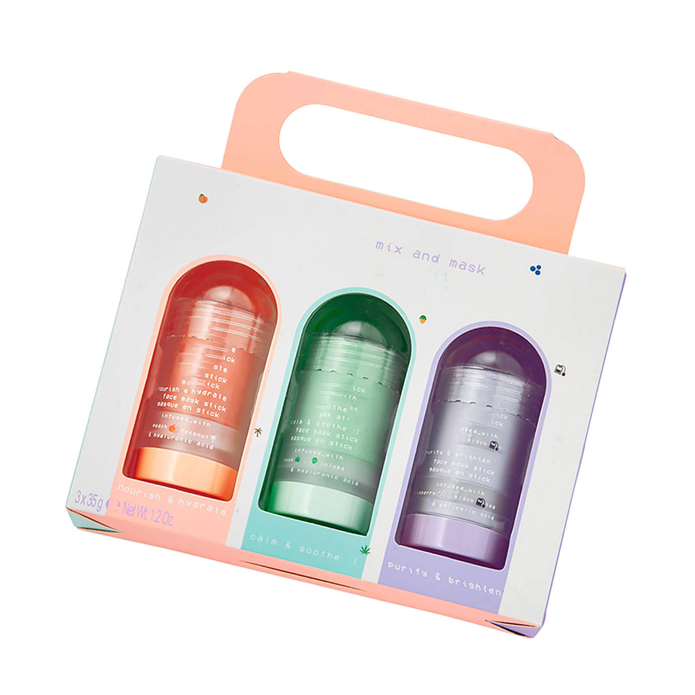
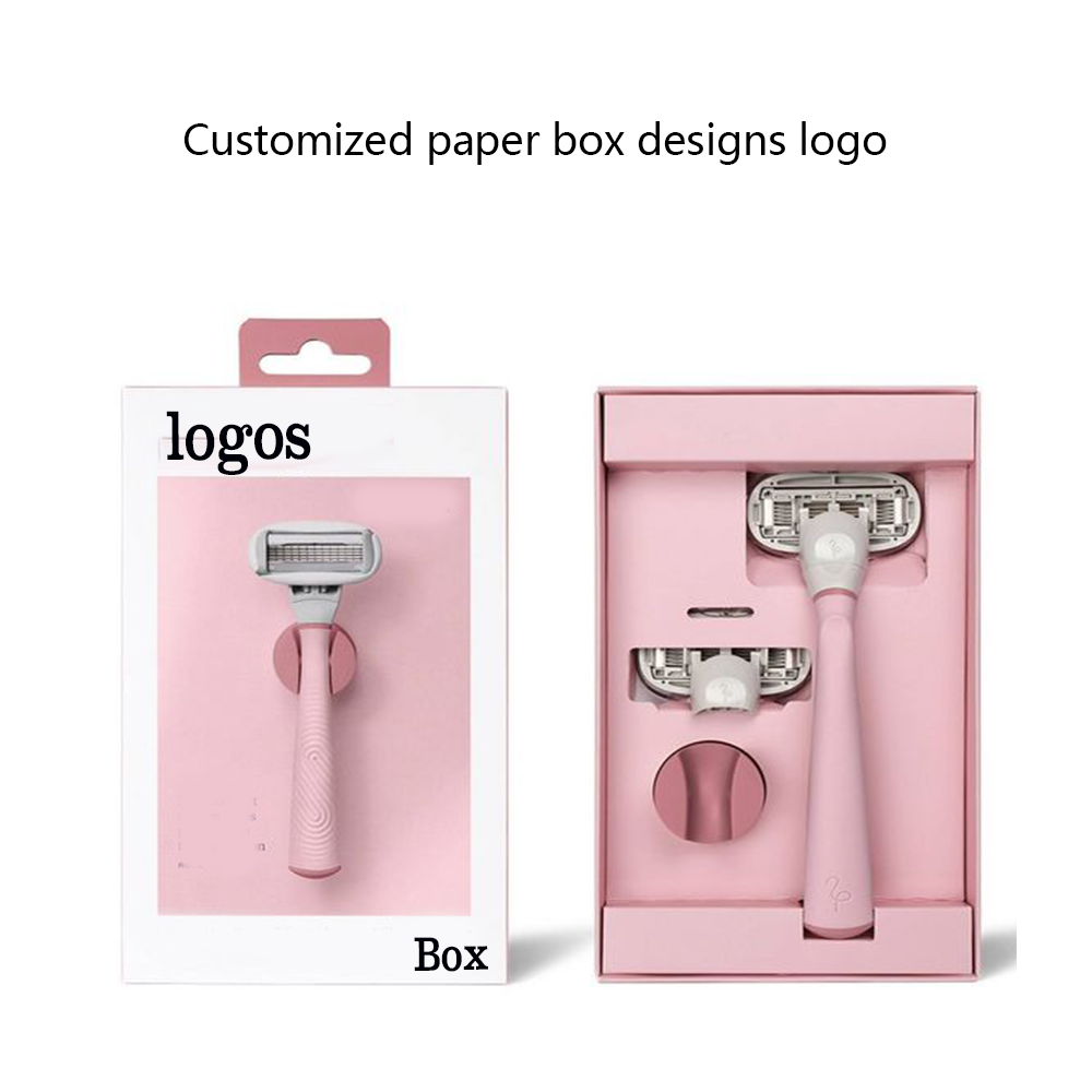
· Pink: Pink is often linked to femininity, sweetness, and playfulness. It’s a common color for perfumes aimed at younger women or those looking for a light, floral fragrance.
· Black: Black packaging is timeless, elegant, and mysterious. It’s commonly used by brands to represent sophistication and high-end appeal. Many iconic perfume brands use black packaging for their signature fragrances to communicate refinement.
3. Differences in Consumer Preference for Color in Different Markets
The influence of color in perfume packaging design can vary greatly across different markets. Cultural differences play a key role in how consumers perceive color. For example:
· In Western markets, red is often associated with passion and love, making it a popular choice for romantic and sensual perfumes.
· In Asian markets, white is often seen as a color of purity and innocence, which makes it a popular choice for light, fresh fragrances. However, white can also symbolize mourning in some cultures, so it’s important for brands to consider these nuances when designing for international markets.
Understanding these regional preferences helps brands tailor their perfume packaging design to better connect with their target consumers in each market.
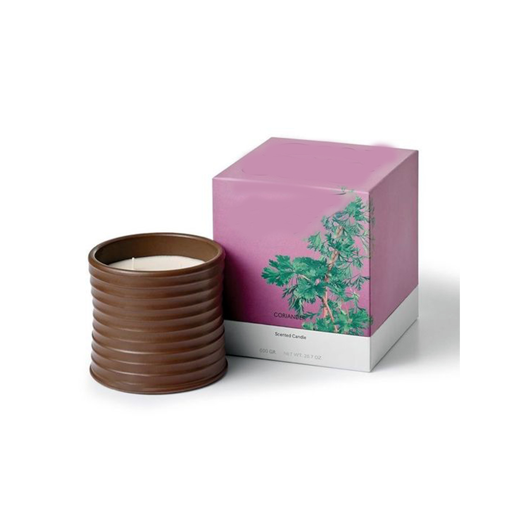 4. Analysis and Trends of Classic Perfume Packaging Colors
While trends in perfume packaging design come and go, certain colors have stood the test of time. Classic colors like black, white, gold, and red are often seen in perfume packaging because they communicate reliability, sophistication, and timeless appeal. These colors have been used by iconic brands like Chanel, Dior, and Tom Ford to convey luxury, prestige, and elegance.
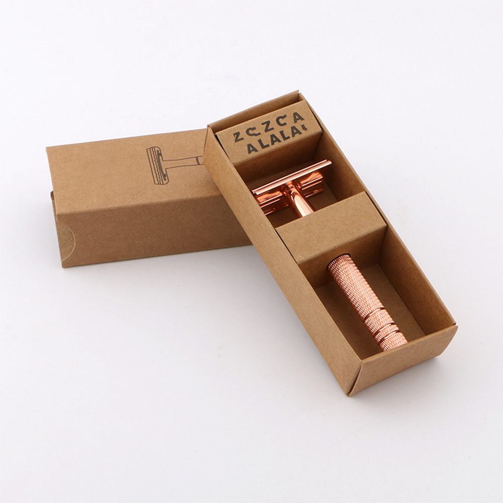
In recent years, however, sustainable and eco-friendly packaging designs have become popular, leading to the rise of earthy tones like greens, browns, and natural whites. These colors not only reflect the shift towards sustainability but also appeal to eco-conscious consumers looking for natural and organic products.
5. How to Enhance the Attractiveness of Perfume Packaging Through Color Matching
To maximize the impact of perfume packaging, it’s important to consider how different colors work together. Color matching or complementary color schemes can create a sense of harmony and balance that appeals to the eye. A well-thought-out combination of colors can also reinforce the fragrance’s key qualities, whether it’s a fresh, floral, or sensual scent.
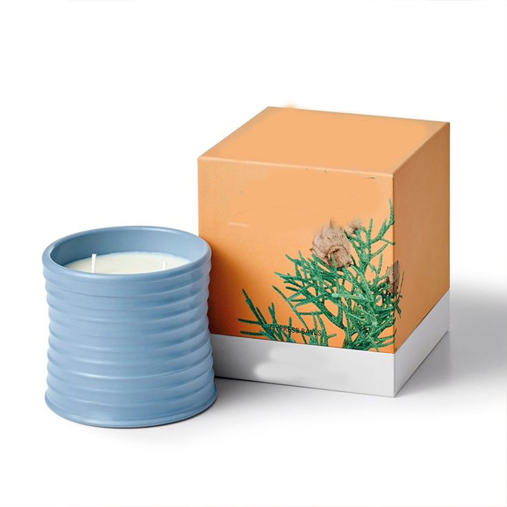 Here are a few tips for effective color matching in perfume packaging:
· Consider the fragrance profile: A fresh citrus scent might pair well with green or yellow, while a deep, woody scent may be best complemented by rich browns or dark purples.
· Use metallic accents: Metallic colors like gold, silver, or copper can add a touch of elegance and sophistication to any packaging design.
· Think about your target audience: Bright and bold colors work well for youthful, energetic brands, while muted tones appeal to more sophisticated consumers.
The Power of Color in Perfume Packaging Design
In conclusion, color psychology in perfume packaging design is an essential element that brands must consider to enhance their market performance and appeal to their target audience. The right hue not only captures the essence of the fragrance but also communicates key messages about the product, such as luxury, freshness, or playfulness.
By understanding the psychological effects of different colors, considering cultural preferences, and keeping an eye on industry trends, perfume brands can create packaging that stands out on the shelf and resonates with their customers. Whether you are designing for a luxury market or a younger, more vibrant audience, the colors you choose for your perfume packaging design can make all the difference.

